The Unexpected Red Theory is a design principle that emphasises the strategic use of red in unexpected places to create a focal point or highlight particular elements in a space. This approach is grounded in the psychological effects of colour, where red is known to evoke emotions, draw attention and create visual interest.
Red is a powerful colour associated with energy, passion and excitement. It’s a colour that naturally draws the eye, making it a potent tool for designers aiming to inject life into a room. The theory proposes that by placing red in unexpected locations, such as the interior of a bookshelf, the back of a door or a hidden corner, the colour can surprise and delight viewers, adding an element of surprise to the design.
The Psychology Behind Red
Before delving into how the Unexpected Red Theory works, it’s crucial to understand the psychological impact of red. Red is one of the most dynamic and emotionally charged colours in the spectrum. It’s often linked to feelings of warmth, passion and energy. Studies have shown that red can increase heart rate and create a sense of urgency, which explains why it is commonly used in warning signs and advertisements to grab attention.
In design, red can be used to evoke a sense of luxury, excitement or intimacy. It can also stimulate appetite, which is why it is frequently used in restaurant design. However, too much red can be overwhelming or aggressive, which is why the Unexpected Red Theory uses it sparingly and strategically to create balance.
Creating Focal Points
One of the most effective uses of the Unexpected Red Theory is in creating focal points within a room. A red accent wall, a vibrant piece of art or a bold piece of furniture can instantly draw the eye and establish a pivotal point of interest. This technique is particularly useful in open-plan spaces where defining separate areas can be challenging.
For example, a red dining table in an open kitchen-dining area can distinguish the dining space from the rest of the room, making it a focal point that naturally attracts guests and encourages social interaction. In the living room, a bright red rug laid over dark brown flooring draws attention and helps to define the space with warmth and texture.
Highlighting Architectural Features
The Unexpected Red Theory can also be used to highlight architectural features that might otherwise go unnoticed. Painting the inside of an archway, the trim of a window or the underside of a staircase in red can accentuate these features, adding depth and character to the space.

In spaces with unique flooring patterns, such as herringbone wood floors or intricate tiles, incorporating a subtle red border or inlay can highlight these features and create a cohesive design that ties the room together.
In historic homes, where unique architectural details are a significant part of the charm, this method can be particularly effective. By using red in this way, designers can honour the history of the building while adding a contemporary twist.
Adding Warmth and Energy
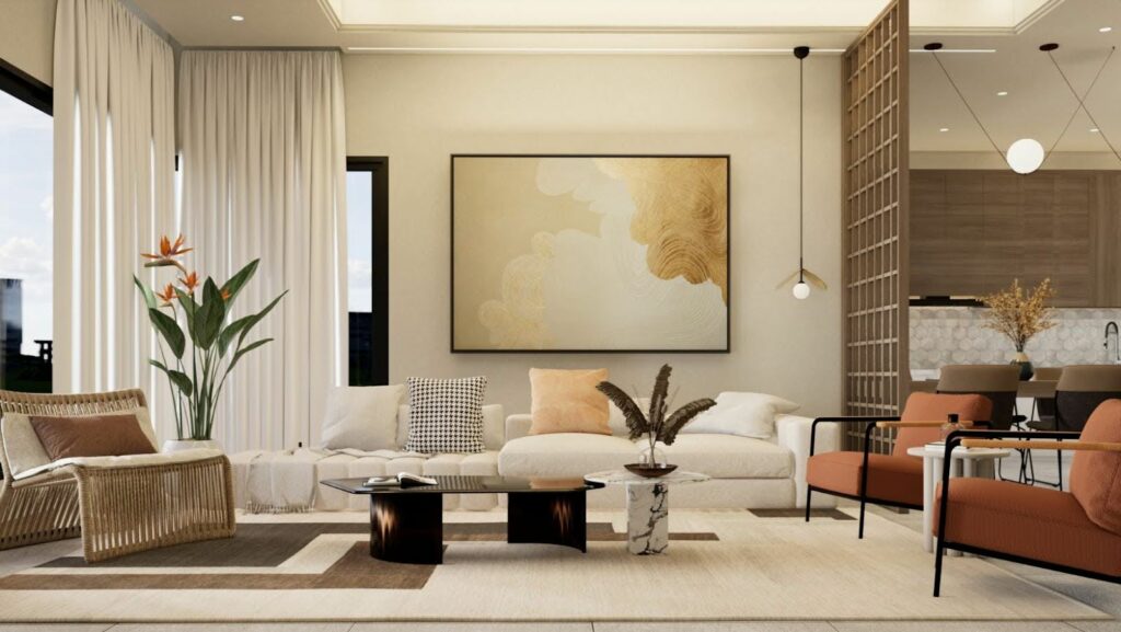
In spaces that feel cold or impersonal, such as offices or minimalist homes, a touch of red can add much-needed warmth and energy. A red rug, a set of red cushions or even a red lampshade can transform a sterile environment into a welcoming space.
This theory is especially popular in workspaces, where red can stimulate creativity and productivity. A red accent wall or desk chair can invigorate the room, encouraging a lively and dynamic atmosphere.
Balancing Neutral Palettes
Neutral colour palettes, such as greys, whites and beiges, are timeless and versatile but can sometimes feel bland or uninspiring. The Unexpected Red Theory provides an antidote to this by introducing a splash of colour that breaks the monotony and adds interest.
In a neutral living room, a red throw or a set of red books on a shelf can serve as a small but impactful addition that enlivens the space. This approach allows homeowners to maintain the elegance of a neutral palette while incorporating a playful touch.
Tips for Implementing the Theory
If you’re new to the Unexpected Red Theory, start with small accents like cushions, artwork, or lampshades. This allows you to experiment with the impact of red without overwhelming the space.

Think about the existing colour palette and design elements in the room. Choose a shade of red that complements these elements to ensure harmony and cohesion.
Use red strategically to create balance. Too much red can be overpowering, so aim to distribute it evenly across the space to maintain equilibrium.
Red can be introduced through various materials, such as fabrics, ceramics, or metals. Experiment with different textures to add layers of interest and complexity to your design.

